Top A

Top-a with its default styling.

Top B

Top-b with its default styling.

Top C

Top-c with its default styling.

Top D

Top-d with its default styling.

Top E

Top-e with its default styling.

Top F

Top-f with its default styling.

Feature A

Feature-a with its default styling.

Feature B

Feature-b with its default styling.

Feature C

Feature-c with its default styling.

Feature D

Feature-d with its default styling.

Feature E

Feature-e with its default styling.

Feature F

Feature-f with its default styling.

phone

Showcase A

Showcase-a with its default styling.

Showcase B

Showcase-b with its default styling.

Showcase C

Showcase-c with the box1 suffix.

Showcase D

Showcase-d with the box2 suffix.

Showcase E

Showcase-e with the box3 suffix.

Showcase F

Showcase-f with the box4 suffix.

Utility A

Utility-a with its default styling.

Utility B

Utility-b with the box1 title1 suffix.

Utility C

Utility-c with the box2 title2 suffix.

Utility D

Utility-d with the box3 title3 suffix.

Utility E

Utility-e with the box4 title4 suffix.

Utility F

Utility-f with the box1 title2 suffix.

MainTop A

MainTop-a with its default styling.

MainTop B

MainTop-b with the box2 title3 module suffix.

MainTop C

MainTop-c with the box3 title4 module suffix.

MainTop D

MainTop-d with the box4 title1 module suffix.

MainTop E

MainTop-e with the box1 title3 module suffix.

MainTop F

MainTop-f with the box2 title4 module suffix.

Content Top A

Content-Top-a with the pattern1 module class suffix.

Content Top C

Content-Top-c with the pattern2 module class suffix.

Preset Styles

Access the Style Control settings from Admin → Extensions → Template Manager → rt_camber_j15 → Settings.

Simple configure the options, then save and Gantry will automatically load the modified preset to your site.

Color Chooser Settings

Image

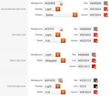
A Color Chooser template uses CSS color values, combined with transparent overlay images, to determine its color and style. Therefore, you can change the entire color scheme via the Gantry Administrator. The available options are outlined below:

  • Background: Background, Overlay (Light/Dark), Pattern, Text, Link & Accent
  • Top: Background, Overlay (Light/Dark), Width (Full/Wrapper), Text, Link & Accent
  • Body: Background, Overlay (Light/Dark), Width (Full/Wrapper), Text, Link & Accent
  • Footer: Background, Overlay (Light/Dark), Width (Full/Wrapper), Text, Link & Accent

Other Style Settings

  • Load Transition: On - Off; Enable or disable the page loading transition animation effects
  • Fixed Header: On - Off; Enable or Disable a fixed floating header section.
  • Read More Style: Button and Link; Set the read more link styling for the template
  • Web Fonts: On - Off, Google Font Directory; WebFonts allow you to use 3rd party WebFonts from providers such as Google. You must SHOW then APPLY before the new fonts will show up in the Font Family dropdown.
  • Font Settings: Select a font family from the available options and also choose a default font size
    • Font Family: Camber, Geneva, Optima, Helvetica, Trebuchet, Lucida, Georgia, Palatino, or Various Google Fonts (dropdown)
    • Font Size: Default, Extra Large, Large, Small, Extra Small (dropdown)


Assigning a Style to a Specific Page

Image

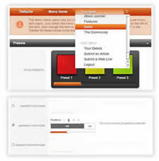
With Gantry, the ability to assign a certain style to an individual page has never been easier and/or more efficient. Just follow these simple steps:

  • Go to Extensions → Template Manager → rt_camber_j15
  • Select the Menu Items tab - located in the right column of the page in the orange box
  • Choose a menu item you wish to assign a different style to
  • Select your preset of choice from the Presets → Style Presets parameter area
  • Configure the Settings area to your personal preferences
  • Save

Gantry Framework: Per Menu Item Controls

Category: Demo Articles

Content Bottom A

Content-Bottom-a with its default styling.

Content Bottom C

Content-Bottom-c with its default styling.

Sidebar A

All Sidebar positions can be alternated, such as Side Main Side Side.

This is done via a sliding configuration option in the template manager.

More

Sidebar A

Sidebar-a with its default styling.

More

Sidebar A

Sidebar-a with the box4 title2 pattern8 suffix.

More

Sidebar B

Sidebar-b with the box1 pattern1 module class suffix.

More

Sidebar B

Sidebar-b with its default styling.

More

Sidebar B

Sidebar-b with the box3 title1 pattern15 suffix.

More

Sidebar B

Sidebar-b with its default styling.

More

Sidebar C

Sidebar-c with the box2 pattern10 module class suffix.

More

Sidebar C

Sidebar-c with its default styling.

More

Sidebar C

Sidebar-c with the box1 title4 suffix.

More

Sidebar C

Sidebar-c with its default styling.

More

Bottom A

Bottom-a with its default styling.

Bottom B

Bottom-b with its default styling.

Bottom C

Bottom-c with its default styling.

Bottom D

Bottom-d with its default styling.

Bottom E

Bottom-e with its default styling.

Bottom F

Bottom-f with its default styling.